Kategorie: Inspiration

A play with V

IMG_8780-a
IMG_8791-a
IMG_8786-a

(book printed by Jens Hansen)

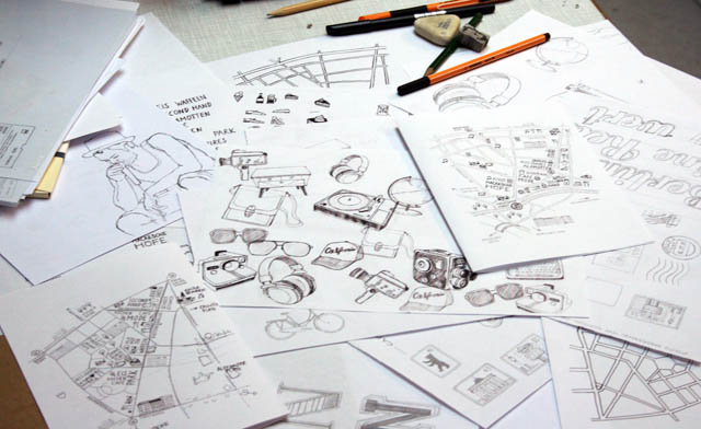
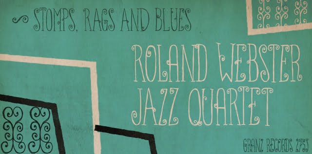
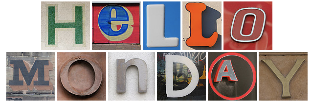
Schrift spielerisch einsetzen – da rennt man ja bei mir offene Türen ein. Ich habe in den letzten Wochen drei inspirierende Drucksachen erhalten, die ich hier mal zeigen will.
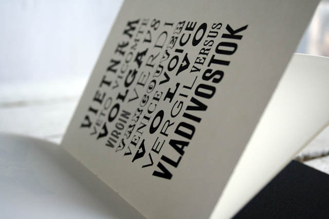
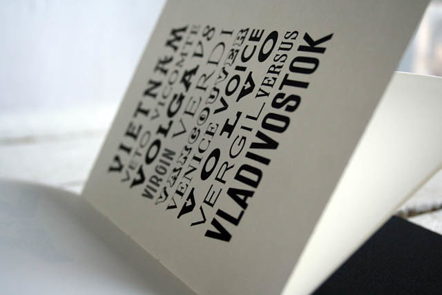
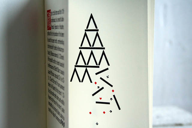
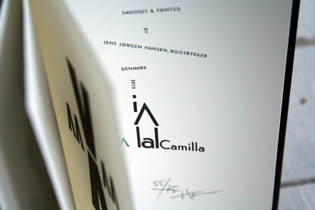
„A play with V“ ist ein hübsches Büchlein, das mir Jens aus Dänemark geschickt hat. Komplett handgesetzt, auf seiner dänischen Andruckpresse Eickhoff gedruckt und handgebunden. Sehr sehr schön. Jens – bogtrykkeren – ist ein flickr Kontakt von mir, sein Photostream bietet noch mehr Bilder von dem Büchlein und einen Einblick in seine Werkstatt. Er gibt auch Workshops für die unter Euch, die in Dänemark wohnen oder Urlaub machen.
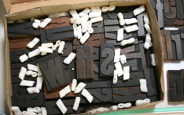
Mich hat das Büchlein so beeindruckt, da ich um die Arbeit weiß, die in schräg gesetzten Texten steckt. Im Computer können wir eine Zeile rotieren lassen, wie es uns passt, aber mit Blei? Man muss die ganzen Lücken mit Blindmaterial füllen und alles richtig schließen, damit es nicht um- oder rausfällt. Schaut hier. (Und hinterher alles wieder wegsortieren…) Ich vermute das Setzen hat so seine Zeit gedauert. Aber es sieht total gut aus! Tak, tak Jens!
——–
Playing with type is totally up my alley. I received three inspiring works in the last weeks that I’d like to show, starting today with the book Jens sent from Denmark.
„A play with V“ is a little book, handset and hand printed on his danish proof press Eickhoff. Also hand bound. Awesome! Jens – bogtrykkeren – is a flickr contact of mine and his photostream is full of interesting pictures from his space, his letters and typecases and his press. You can also see more pictures of the little book there and if you are interested in a copy drop him an email. (And he gives workshops, if you are located in denmark.)
I am thrilled by the graphics because I know setting type that way, diagonal or somewhat vertical, makes the typesetters life not easy. One has to fill all gaps with spacing and make sure that everything is locked and won’t fall off. See here. I guess he spent hours to set and print this book. But what a beauty. Tak, tak Jens!

some scribbles

Ein kleiner Schnappschnuss von einer ganz anderen Baustelle. Jana und ich zeichnen zusammen seit August an einem kleinen Buch über Berlin und es sieht so aus, als kriegen wir es bis zum Dezember in den Druck. Mehr wird noch nicht verraten, aber ich halte Euch auf dem laufenden.
——–
This is a peek what’s going on beside all the printing. Jana and me doing a project together. Since a few month we’ve been drawing everything we like about berlin. And it seems we’ll finish it in december. Hooray. I’ll keep you informed.

my new online shop

my shop

Tadaaa. Viele viele Wochenenden sind ins Land gegangen und nun ist mein eigener Shop online. Hurra! Fluchend programmierend saß J. die ein und andere Nacht vorm Rechner und ich war wohl auch keine überaus liebenswürdige Auftraggeberin… warum sind da so viele Pixel, wieso ist das jetzt schon wieder fett, nein so aber nicht, lieber anders :)) Aber wie ist es nun geworden? Schön finden wir.
So langsam werden noch ein paar Produkte ergänzt, Schreibfehler eliminiert und irgendwann gibt’s vielleicht auch mal Paypal. Und internationalen Versand dann später.
——–
Here we go. My brand new online shop is live now! Hooray. Nights over nights spent J. with programming while I was like: why is this bold, why is this too close, I don’t like it that way do it the other way… :)) uhm. But he did a great job, right? Looks fantastic and I am happy. But for now the shop is only in german and there is no international shipping and no paypal… sorry guys from UK, US, Canada, Australia, north and east europe… I see you but for the moment please send me an email if you want to purchase anything. 

hamburg alphabet

(copyright by chris campe)

Erinnert ihr Euch noch an meinen Blog Post über Chris Campe? Nicht nur illustrativ sondern auch mit der Kamera scheint sie den Buchstaben auf der Spur zu sein. Das ist ja was für mich, urbane Typographie in Form von Ladenschildern. Wunderbar. Da kriegt man doch gleich Lust selbst mit der Kamera loszuziehen, oder? Wie oft habe ich mich schon geärgert, selbige zu Haus vergessen zu haben wenn mir eine Fassade in Berlin auffiel. Naja, man kann nicht alles machen. Chris hat jedenfalls noch bevor sie nach Chicago aufbrach ihre Fotos in dem Buch „Hamburg Alphabet“ zusammen gestellt, das diese Woche im Junius Verlag erscheint. Daumen hoch! Website
——–
Do you remember my blog post about Chris Campe and her handletterings? It seems she’s also addicted to urban typography and that’s totally up my alley. She collected photos of store signs in Hamburg and turned them into a book before she left for Chicago. This book called „Hamburg Alphabet“ will be published this week at Junius publisher. I like!  website

berlin maps

1. Stadtplan Berlin – 1975,  2. Pharus Map – Rund um Berlin  c 1950,  3. Stadtplan von  Berlin 1948., 4. Stadtplan Berlin – 1973, 5. Berliner Stadtplan. c 1950, 6. Stadtplan von Berlin 1:25000  c 1952,

Beim Suchen nach einem Stadtplan bin ich über die hier gestolpert. Ganz schön interessant, oder? Den Palast der Republik links oben gibt es ja nicht mehr und der Berliner Bär wird im Wappen unten rechts wird heutzutage immer mit der Schnauze nach links abgebildet. Und ganz am Schluss habe ich gesehen, dass unten links im „B“ der Fernsehturm steckt…
——-
While searching for a map I stumbled upon these old ones about Berlin. Interesting graphics. One building on the top left doesn’t exist anymore and the bear in the emblem is flipped nowadays. And if you look closely you see the television tower in the „B“ on bottom left. He he…

a stamp a day

Na, wenn das nicht ein Kalender nur für mich ist, dann weiß ich auch nicht. Das ganze Jahr als Briefmarken, jeden Tag eine zum ausfüllen und abreißen. Große Klasse! Da braucht man gar nicht mehr zu sagen, oder? Gekauft! Den Wall Planner gibt es bei Present&Correct und das wundert mich auch kein bißchen. Die machen ja auch noch mehr schöne Dinge 🙂
Allen ein schönes Wochenende!
——–
This wall planner is quite my thing, totally made for me. Each day is a stamp to fill out and tear off. And it it is totally perforated! Great. Superb. Bought! No wonder that it’s from Present&Correct, they make so many awesome things. 🙂 Have a great weekend, everybody!

type thursday

(all pics by myfonts)

So, hier mal was digitales… neulich nachts habe ich mich durch myfonts geklickt und diese Schriften hier haben mir besonders gut gefallen: RitornelosStrangelove NextAmarelinha, und Erika. Sieht so aus, als wäre ich in der Handschrift-Phase… nur gut, dass ich auf neues Blei sparen muß, sonst hätte ich wohl mal wieder ne .otf Schrift gekauft.
——–
Here I am back with something digital. I browsed through myfonts at night and I really enjoyed what I’ve found. Obviously I like handlettering… so here are my favourites: RitornelosStrangelove NextAmarelinha and Erika. Luckily I have to save money for new lead type otherwise I would have bought some open type fonts. 

spell with flickr

Gestern Abend habe ich spell with flickr gefunden. Mit dem Laptop auf den Knien hab ich mir ewig neue Wörter ausgedacht bis der Akku heiß lief. Toll. Was man so alles programmieren kann… klasse. Oder?
——–
Last night I found spell with flickr. What a great project! While balancing the macbook on my knees I tried words over words ‚til the battery got too hot. What fun. 

woodtype and typesetting

woodtype1
typesetting
Neben einigen neuen Holzbuchstaben habe ich seit letzter Woche ein neues altes Fachbuch. Der Verlag ist nicht angegeben und ich frage mich, ob es wohl handgesetzt wurde. Neben interessanten Texten gibt es ein „100 Fragen – 100 Antworten“ Verzeichnis. In dem steht, dass man den Gehilfen des Setzers früher Pachulke nannte. {Hieß so nicht auch der Nachbar von Peter Lustig?} Außerdem steht dort, dass Blei bei 327° schmilzt und dass ein Antiqua Setzkasten 125 Fächer hat. Und zu guter letzt wird erwähnt, dass man Schriften, die weder Antiqua noch Frakturcharakter haben Bastardschriften nennt. Hui, wie böse.
——–
I got new woodtype last week. Can you see the ff-ligature? Yay. But the g, y, x and j are missing. And I bought a book about typesetting where terms of the graphic art are explained. I felt like reading a specialist book to get deeper in that trade.